

How to Design a Sign That Stands Out
A great sign does more than display your logo – it works for your business 24/7. It attracts attention, reinforces credibility, and helps customers instantly understand who you are and what you do. Whether you’re fitting out a new building or upgrading tired signage, good design is the difference between blending in and standing out while staying within government and local body regulations.
This guide is written for New Zealand businesses, with local conditions and real-world considerations in mind – especially those in Rotorua or in the Bay of Plenty.
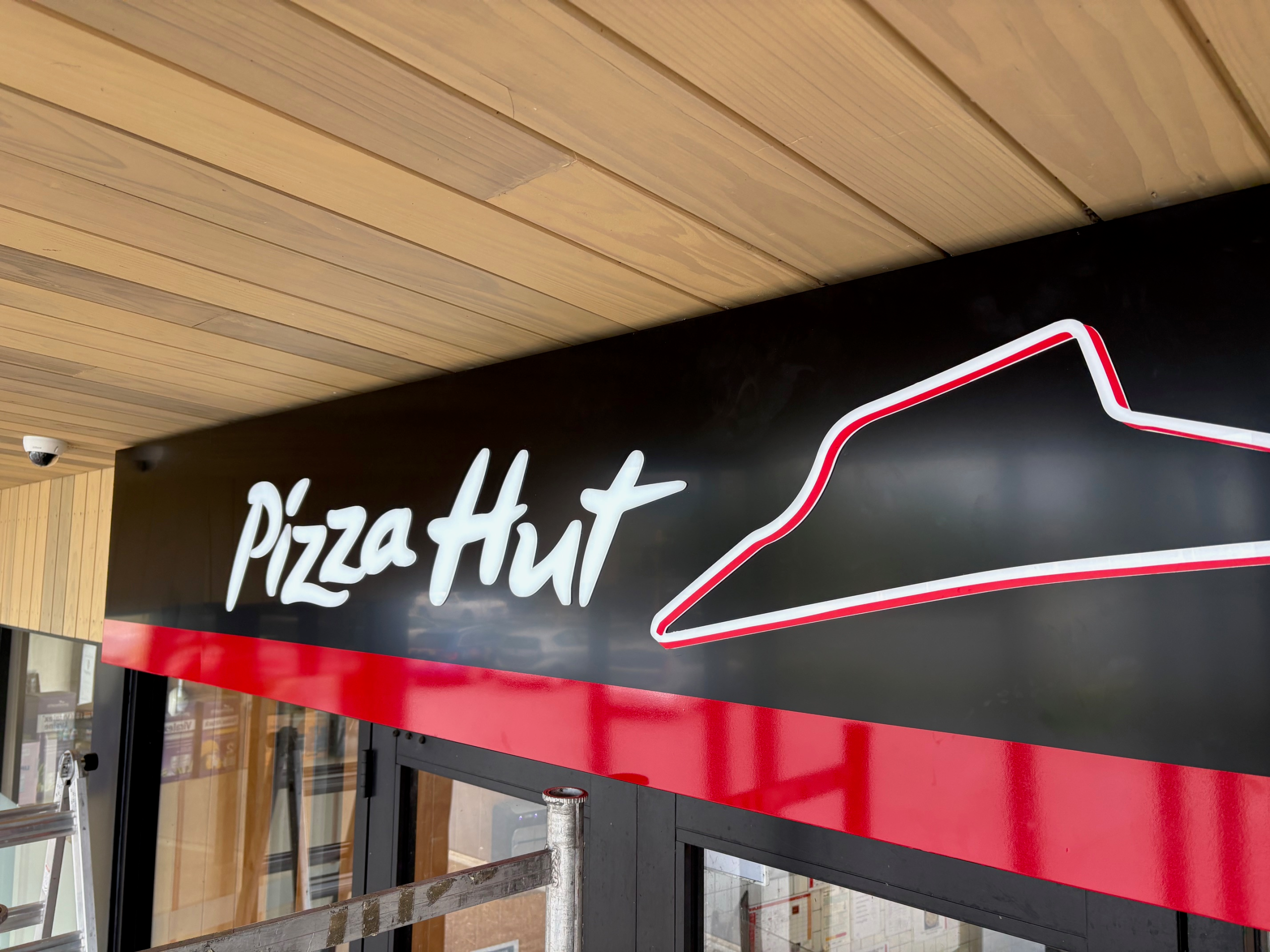


1. Start With Purpose, Not Artwork
Before choosing colours or fonts, define the job your sign needs to do.
From first principles:
-
A sign must be seen
-
It must be understood quickly
-
It must be remembered
Ask:
-
Is this sign primarily for brand presence, wayfinding, or attracting passing traffic?
-
Will it be viewed by pedestrians, vehicles, or both?
-
From what distance and angle?
A sign designed for a busy roadside in Rotorua has very different requirements to signage on a quiet commercial building or industrial yard.
It is worth noting these points on signage regulations in New Zealand:
- A sign does not require a building consent if no single face of the sign is over 6 square metres and is no higher than 3 metres above supporting ground level (Source: building.govt.nz)
- There is no restriction on size or height above the supporting ground as long as the structure has been reviewed by a Chartered Professional Engineer (Source: building.govt.nz)
2. Prioritise Legibility Over Everything
If people can’t read it, the sign has failed – regardless of how good it looks.
Key fundamentals:
-
Use simple, bold typefaces (avoid thin or overly decorative fonts)
-
Ensure high contrast between text and background
-
Limit wording — fewer words = faster comprehension
As a rule of thumb:
If it can’t be read within 2-3 seconds, it’s too complicated.
This is especially important for high-traffic areas throughout the Bay of Plenty where viewers may only glance at your sign while driving past. At Starsign we can provide input to the signs design based on our 30 years in the industry.
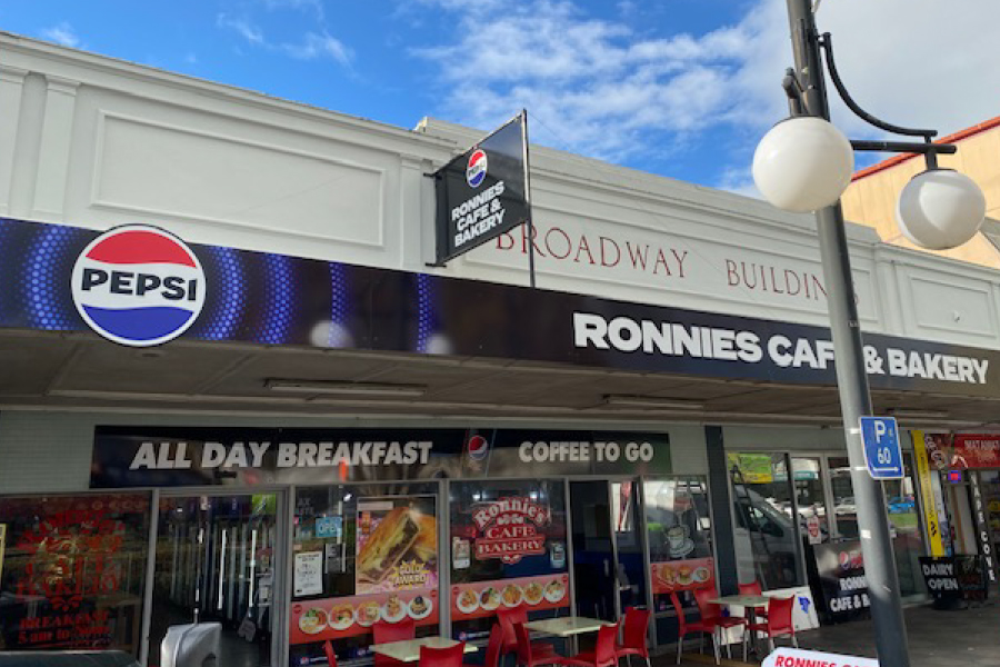
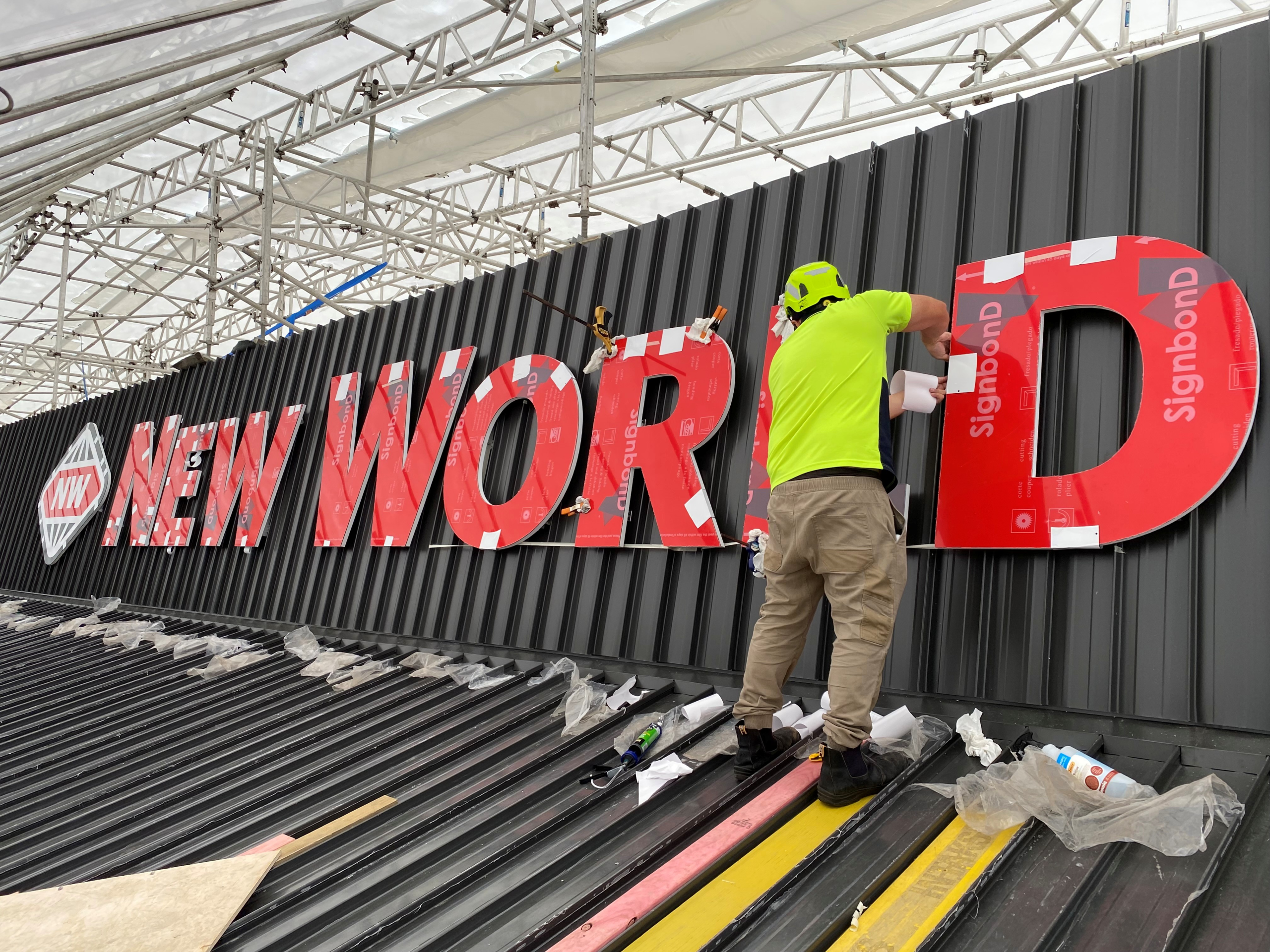
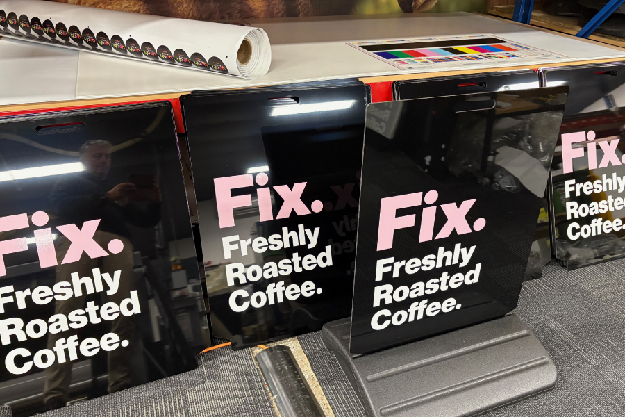
3. Choose Colours That Work in the Real World
Colour choice isn’t just about brand — it’s about physics and environment.
Consider:
-
Bright sunlight and glare (common in NZ conditions)
-
Overcast or rainy days
-
How colours fade over time outdoors
Strong signage uses:
-
Dark text on light backgrounds (or vice versa)
-
A restrained palette — usually 2–3 colours max
-
Brand colours that are adapted, not forced
Your logo colours might look great on screen but need adjustment to remain readable on a building facade.
An example of this was a client of Starsign wanting a light olive text over a dark green background which was not visible at night due to the signs location adjacent redwood forest where in the afternoon a dark shadow would cover the sign. In this scenario we opted for a white background.
4. Scale Matters More Than You Think
One of the most common mistakes is signage that’s simply too small.
General guidance:
-
Every 10 metres of viewing distance needs roughly 25–30 mm of letter height
-
Building signs often need to be larger than clients expect
In commercial areas across Rotorua and Tauranga, undersized signage is one of the main reasons businesses get overlooked — even with good branding.
5. Use the Right Sign Type for the Job
Not all signage performs the same. The structure of the sign often matters as much as the design.
Common building signage options:
-
3D letters for premium, professional presence
-
Illuminated signs for night visibility and long winter evenings
-
Panel signage for cost-effective clarity
-
Blade or projecting signs for pedestrian traffic
The best results often come from combining sign types. For example, a main building sign plus secondary directional or window signage.
6. Design for the Building, Not Just the Brand
A sign should look like it belongs on the building – not like it was added as an afterthought.
Good signage design considers:
-
Wall materials and mounting fixtures (concrete, cladding, glass, brick)
-
Mounting height and visibility lines
-
Architectural features that can frame the sign
A well-designed sign works with the building, enhancing both the structure and the brand.



7. Think Long-Term Durability
Outdoor signage in New Zealand must handle:
-
UV exposure
-
Wind
-
Moisture
-
Temperature changes
- Sulphur and Coastal air (depending on location)
That’s why material selection matters:
-
Aluminium and composite panels for longevity.
-
Quality vinyls, lamintation and inks for colour stability
-
Proper fixings to prevent movement or fatigue
A sign that looks good for 6 months but fades or fails after a year costs more in the long run.
8. Local Knowledge Makes a Difference
Designing signage for New Zealand – and especially for regions like Rotorua and the Bay of Plenty – requires local understanding:
-
Council regulations and consent requirements
-
Coastal vs inland exposure
-
Local viewing habits and traffic flow
Working with a local signage team ensures your design is not only attractive, but compliant, durable, and effective in the real world. Talk with our knowledgable team today and lets get your branding standing out against the crowd!
Final Thoughts: Simple, Clear & Confident
The most effective signs share three traits:
-
Simple – easy to process at a glance
-
Clear – no confusion about who you are and what you do
-
Confident – strong, well-proportioned, and professionally made.
If you get those fundamentals right, your signage won’t just stand out – it will actively bring customers through the door.
If you’re planning new building signage in Rotorua, the Bay of Plenty, or anywhere in New Zealand, investing time in the design stage is the smartest place to start. Starsign has the top equipment in Rotorua for large format printing, we pride ourselves on quality craftmanship, speed of delivery and install, and, last but not lease, fair pricing.
Check out our PDF guide to “StarSign Signage & Display Playbook – Complete Signage Guide for NZ Businesses”